Web accessibility is no longer an optional feature or a post-launch polish phase in software development; it is a fundamental engineering discipline. Designing and building accessible web applications ensures that digital products are usable by everyone, including people with visual, auditory, motor, or cognitive disabilities. As front-end architectures grow increasingly complex with modern JavaScript frameworks, maintaining strict adherence to the Web Content Accessibility Guidelines (WCAG) 2.1 becomes vital for delivering robust, inclusive user experiences.
Many developers mistakenly view accessibility as a tedious checklist that restricts creative design or adds excessive development overhead. In reality, accessible code is simply high-quality code that inherently improves search engine optimization (SEO), enhances mobile usability, and reduces general tech debt. By understanding the core principles of WCAG 2.1 at a foundational level, developers can integrate accessibility directly into their daily workflows, component libraries, and automated testing pipelines without sacrificing speed or aesthetic appeal.
This comprehensive guide serves as a practical, hands-on playbook for web developers seeking to master WCAG 2.1 compliance. From mastering color contrast ratios and keyboard navigation patterns to writing meaningful alternative text and implementing proper WAI-ARIA attributes, this guide breaks down technical standards into actionable coding strategies. By the end of this article, you will have a deep understanding of core WCAG requirements, practical implementation techniques, and an essential pre-ship checklist to ensure your web applications are fully accessible to every user.
Understanding WCAG 2.1 Principles for Developers
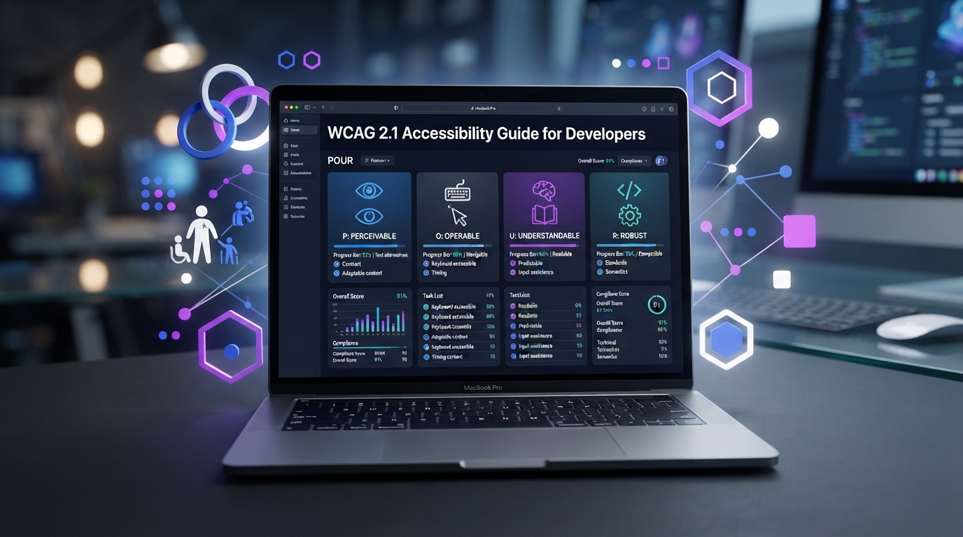
The Web Content Accessibility Guidelines (WCAG) 2.1 are organized around four main foundational principles, often referred to by the acronym POUR: Perceivable, Operable, Understandable, and Robust. For developers, these principles represent the core criteria against which every UI element, interaction, and data presentation must be evaluated. Perceivable requires that information and user interface components be presented in ways all users can perceive, meaning content cannot be invisible to all of a user’s senses. Operable mandates that user interface components and navigation must be fully functional using various input methods, particularly keyboard-only navigation.
Understandable dictates that information and the operation of the user interface must be clear, predictable, and simple to comprehend, minimizing cognitive friction and input errors. Robust stresses that content must be reliable enough to be parsed accurately by a wide variety of user agents, including current and future assistive technologies like screen readers, screen magnifiers, and speech recognition software. Each of these four principles contains specific guidelines, which are further divided into testable Success Criteria categorized into three conformance levels: Level A (minimum requirement), Level AA (the global legal standard for most commercial and public websites), and Level AAA (the highest, specialized level of accessibility).
Understanding the progression from WCAG 2.0 to 2.1 is critical for modern front-end engineers. Released to address emerging mobile and device interaction patterns, WCAG 2.1 introduced 17 new success criteria focused on mobile accessibility, low vision, and cognitive disabilities. These additions include requirements for text reflow without horizontal scrolling, dynamic text spacing adjustments, orientation independence, custom pointer gestures, and minimum target sizes. Mastering these four principles enables developers to move beyond superficial compliance and build digital products that offer equitable access by default.
Master Color Contrast Ratios for Accessible Design
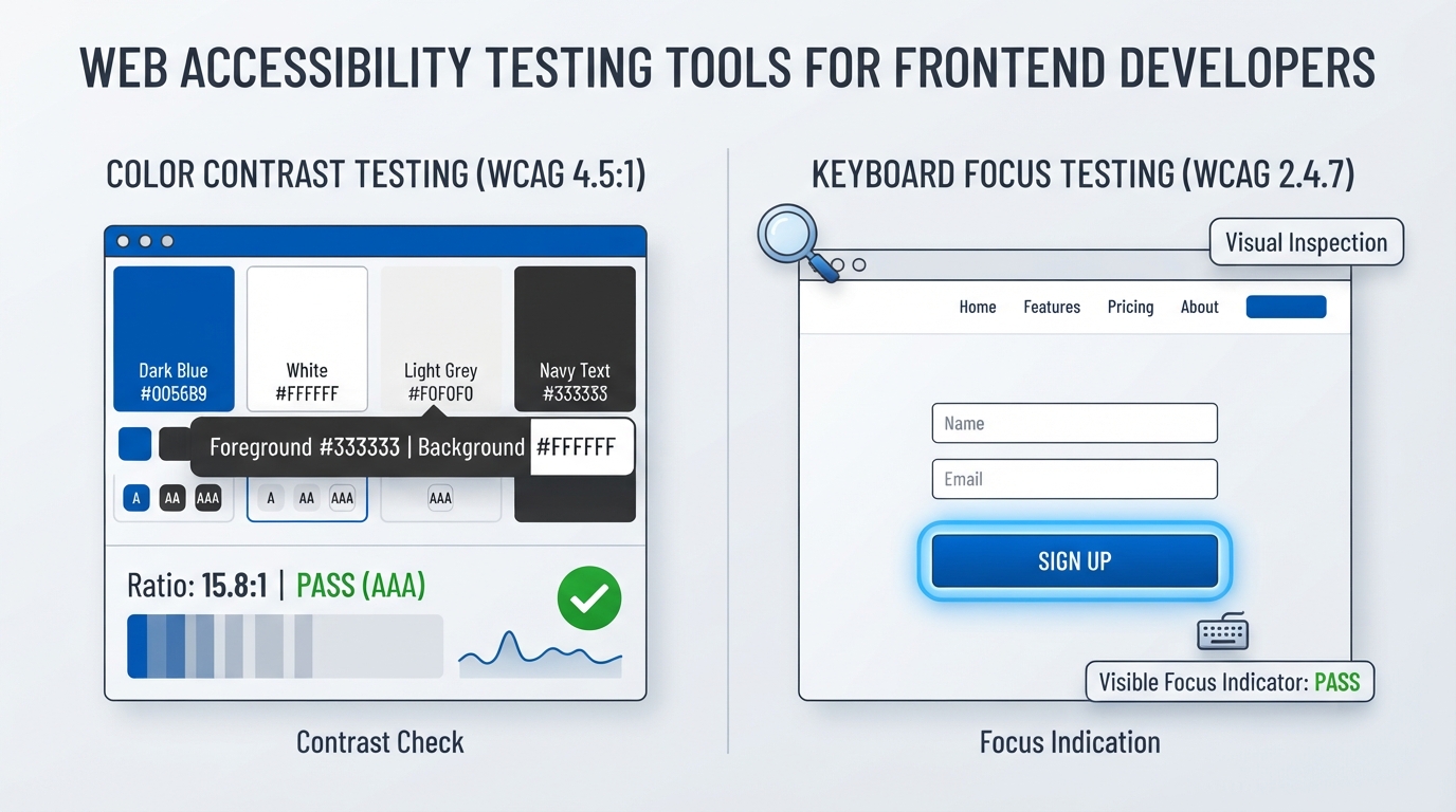
Color contrast is one of the most critical visual aspects of web accessibility, directly impacting users with low vision, color vision deficiencies, or those using mobile devices in high-glare environments. WCAG 2.1 Success Criterion 1.4.3 requires a minimum visual contrast ratio of 4.5:1 for standard text (under 18pt regular or 14pt bold) and 3:1 for large text (18pt and larger, or 14pt bold and larger) to achieve Level AA compliance. Achieving Level AAA compliance requires an elevated contrast ratio of 7:1 for standard text and 4.5:1 for large text, ensuring maximum readability under diverse light conditions.
It is equally essential for developers to manage non-text color contrast, introduced under WCAG 2.1 Success Criterion 1.4.11. User interface components, such as form field borders, custom checkboxes, icons, tab outlines, and focused elements, must maintain a minimum contrast ratio of 3:1 against adjacent colors. A common developer mistake is relying on low-contrast gray placeholders or light border lines that disappear entirely for users with low vision. Furthermore, developers must never rely solely on color to convey information, state changes, or validation errors; visual indicators like icons, underline styles, or text messages must accompany color indicators to assist color-blind users.
Programmatically managing color contrast across modern web applications involves leveraging modern CSS custom properties and automated testing utilities. By defining design system tokens with high-contrast color pairings, teams can enforce brand consistency while maintaining WCAG compliance. Tools like the Chrome DevTools inspect panel, axe-core extensions, and color contrast analyzers allow developers to compute real-time relative luminance ratios across various component states, including focus, hover, disabled, and active themes.
Keyboard Navigation and Visible Focus Indicator Rules
Keyboard accessibility forms the backbone of web accessibility, as many users with physical motor disabilities, visual impairments, or power users rely exclusively on keyboards or alternative switch devices to navigate the web. WCAG 2.1 Success Criterion 2.1.1 dictates that all functionality of the content must be operable through a keyboard interface without requiring specific timings for individual keystrokes. Interactive elements such as links, buttons, form controls, and custom widgets must be naturally focusable in a logical tab order that mirrors the visual layout of the DOM.
A major pitfall in modern front-end development is the removal or suppressive styling of default focus indicators using CSS like outline: none or outline: 0 without providing a custom visual alternative. WCAG 2.1 Success Criterion 2.4.7 explicitly mandates that any keyboard-operable user interface must have a visible focus indicator. To meet modern standards, developers should utilize the :focus-visible pseudo-class, which applies distinct focus rings only when a user navigates via keyboard, preventing intrusive focus rings during mouse clicks while ensuring complete visibility for keyboard users.
/* Accessible focus indicator pattern */
.button:focus-visible {
  outline: 3px solid #2563eb;
  outline-offset: 2px;
}
Beyond basic focus visibility, developers must prevent keyboard traps (WCAG 2.1.2) where focus gets stuck inside a component, such as a modal dialog or rich text editor, without a clear escape key binding. When implementing overlay components like modals or slide-over drawers, developers must programmatically manage focus by trapping keyboard focus within the open modal, placing initial focus on a sensible element, and returning focus to the triggering element upon closure. Proper handling of standard keyboard events (Tab, Shift+Tab, Enter, Space, Escape, and Arrow keys) ensures intuitive, seamless navigation throughout the application.
How to Write Meaningful Image Alt Text Every Time
Alternative text (alt attributes) allows visually impaired users using screen readers to understand the content and context of images on a web page. WCAG 2.1 Success Criterion 1.1.1 requires that all non-text content presented to the user has a text alternative that serves an equivalent purpose. Writing effective alt text requires understanding the image’s function on the page: whether it is informative, functional, decorative, or complex graphics like charts and diagrams.
Informative images convey essential visual information, such as product photos or news illustrations, and require concise descriptions that capture the core message or detail without unnecessary fluff. Functional images, such as icons inside buttons or clickable banners, must describe the visual target’s action rather than the graphic itself—for example, alt="Search" instead of alt="Magnifying glass icon". Complex graphics like infographics or technical charts require both a short alt summary and a detailed textual description provided in an adjacent element or linked transcript.
Decorative images that offer no contextual value or repeat adjacent text must explicitly present an empty string alt="" attribute or aria-hidden="true". Omitting the alt attribute entirely causes screen readers to read the raw image file URL, creating a frustrating experience for screen reader users. Developers should avoid phrases like “image of” or “picture of” because screen reading software automatically announces the presence of an image before reading the alternative text string.
Implementing ARIA Attributes and Semantic Elements
Accessible Rich Internet Applications (WAI-ARIA) is a powerful specification that supplements HTML to communicate component roles, states, and properties to screen readers. However, the first rule of ARIA development is: “Do not use ARIA if you can use a native HTML element instead.” Native semantic HTML elements, such as ,, ,, and “, come with built-in accessibility semantics, keyboard interaction logic, and browser focus handling that custom ARIA structures must replicate from scratch.
When native HTML elements are insufficient for complex custom UI widgets like accordion panels, tab lists, combo boxes, or custom dropdown menus, ARIA attributes become necessary. Critical ARIA attributes include state management properties like aria-expanded="true|false" for expandable drawers, aria-selected="true|false" for tab controls, and aria-hidden="true|false" to control visual and screen reader visibility. Modern single-page applications (SPAs) frequently rely on aria-live regions (polite vs assertive) to dynamically announce content updates, state changes, and flash error messages without forcing a full page reload.
  Options

  Settings
  Profile
Misused ARIA attributes can create significant accessibility barriers, providing misleading or contradictory information to screen reader users. Common mistakes include attaching role="button" to generic or elements without adding tabindex="0" and keyboard event listeners, or placing conflicting roles on semantic tags. Developers must carefully balance native semantic tags with precise ARIA attributes, systematically validating component structures against the official WAI-ARIA Authoring Practices Guide (APG) patterns.
Web Accessibility Guidelines and Compliance Matrix
Navigating WCAG 2.1 criteria requires clear mapping between technical success criteria, target application elements, and level thresholds. Understanding how different technical requirements correlate with user interface components ensures balanced coverage during development cycles. The compliance matrix below illustrates core WCAG 2.1 AA success criteria, their primary focus areas, and practical development implementations across key UI components.
| WCAG 2.1 Criteria | Success Criterion Name | Conformance Level | Primary Front-End Implementation |
|---|---|---|---|
| 1.1.1 | Non-text Content | Level A | Provide descriptive alt attributes or empty alt="" for decorative assets. |
| 1.3.1 | Info and Relationships | Level A | Use semantic HTML tags (,, “) to preserve document tree hierarchy. |
| 1.4.3 | Contrast (Minimum) | Level AA | Maintain at least 4.5:1 text contrast ratio for normal text and 3:1 for large text. |
| 1.4.11 | Non-text Contrast | Level AA | Ensure 3:1 contrast ratio for graphical objects, state borders, and UI icons. |
| 2.1.1 | Keyboard Access | Level A | Enable full interactive control via keyboard without mouse dependency. |
| 2.1.2 | No Keyboard Trap | Level A | Ensure keyboard focus can enter and leave all components fluidly. |
| 2.4.7 | Focus Visible | Level AA | Apply visible focus styling via :focus-visible CSS rules on interactive controls. |
| 3.3.2 | Labels or Instructions | Level A | Associate form inputs explicitly with ` oraria-labelledby`. |
| 4.1.2 | Name, Role, Value | Level A | Ensure custom widgets expose name, state, and role to screen readers using ARIA. |
Relying solely on automated accessibility auditing scripts will catch approximately 30% to 50% of potential WCAG violations, such as missing alt text attributes or basic color contrast issues. Manual verification remains essential for testing keyboard navigation flow, complex ARIA state updates, and subjective criteria like alternative text clarity. Modern front-end teams must incorporate a hybrid audit approach combining static analysis plugins, automated browser integration suites, and manual screen reader testing across screen reading software like VoiceOver, NVDA, and JAWS.
Essential Accessibility Checklist Before You Ship
Before deploying any feature or major production build, engineering teams should execute a systematic accessibility audit to ensure zero regressions are pushed to live environments. This checklist brings together key criteria across visual layout, keyboard mechanics, screen reader compatibility, and responsive design, providing a streamlined verification procedure for modern software workflows.
1. Visual & Layout Audit
- Verify that all standard body text satisfies the minimum 4.5:1 contrast ratio threshold.
- Ensure all form inputs, icon graphics, focus indicators, and state borders maintain a 3:1 contrast ratio against background colors.
- Test layout scaling up to 200% zoom without horizontal scrollbars or clipping text.
- Check that orientation changes (portrait vs landscape) do not block or truncate screen content.
2. Keyboard & Interaction Audit
- Confirm all interactive elements (buttons, links, form inputs, custom menus) are fully focusable using the
Tabkey. - Ensure tab navigation follows a logical, predictable visual flow through the DOM hierarchy.
- Verify that visible focus indicators are active and clearly identifiable for every element during keyboard navigation.
- Check that interactive elements feature minimum touch target sizes of at least 44×44 CSS pixels (WCAG 2.1 SC 2.5.5).
3. Semantics & Screen Reader Audit
- Confirm all
` tags feature explicitaltattributes oralt=””` for decorative assets. - Verify form control inputs are programmatically tied to labels using matching
forandidattributes. - Check that dynamic notifications, error banners, and loading states utilize appropriate
aria-liveregions. - Validate component semantic architecture using automated tools like axe-core or Lighthouse without zero critical violations.
Web Accessibility FAQ: Essential Developer Answers
What is the primary difference between WCAG 2.0, WCAG 2.1, and WCAG 2.2?
WCAG 2.0 was established in 2008 and focused primarily on desktop web experiences and baseline accessibility requirements. WCAG 2.1 was published in 2018 to address mobile usability, touch gestures, low vision enhancements, and cognitive accessibility needs without altering WCAG 2.0 requirements. WCAG 2.2 builds further on 2.1 by refining focus state visibility, minimizing repetitive input requirements, and improving target sizing for touch interfaces.
For modern development projects, aiming for WCAG 2.1 Level AA or WCAG 2.2 Level AA compliance is recommended, as it fulfills major global accessibility legal standards, including the Americans with Disabilities Act (ADA), Section 508, and the European Accessibility Act (EAA).
Understanding this evolution helps engineering teams prioritize accessibility upgrades effectively while ensuring backward compatibility with older assistive tech stacks.
Can automated tools like Lighthouse or axe-core guarantee 100% WCAG compliance?
No, automated testing tools cannot catch all WCAG compliance issues. Automated tools excel at verifying objective DOM properties, such as color contrast calculations, missing alt attributes, duplicate id attributes, and structural HTML parsing errors. However, automated scripts cannot evaluate subjective requirements, such as whether an alternative text string accurately describes an image’s context or whether custom keyboard navigation feels natural and usable.
Industry studies show that automated linters and auditing tools typically identify between 30% and 50% of overall WCAG compliance violations.
Therefore, automated audits should be paired with manual keyboard navigation checks, screen reader walkthroughs, and user testing with disabled individuals to achieve full compliance.
Is aria-label better than native HTML “ elements for forms?
Native HTML elements are always preferred over `aria-label` attributes for form controls. A native element provides a visible text prompt for all users, increases touch target area by allowing users to click the label to focus the input, and is natively supported across all browsers and screen readers without extra configuration.
aria-label should primarily be used when visual text cannot be rendered due to compact design constraints, such as search input icon buttons or close icons in dialog header bars.
Relying exclusively on aria-label risks creating usable screens for screen reader users while leaving sighted users with visual motor impairments or cognitive difficulties without necessary visual context.
How do I manage screen reader notifications for dynamic single-page application (SPA) updates?
In single-page applications built with frameworks like React, Vue, or Angular, dynamic content updates occur without triggering a full browser page refresh. Because screen readers do not automatically announce silent DOM updates, developers must use ARIA Live Regions (aria-live) to notify screen reader users of state changes, toaster alerts, or form validation messages.
Setting aria-live="polite" instructs screen readers to announce updates when the user pauses, making it ideal for standard notifications, page updates, or status updates. Using aria-live="assertive" causes the screen reader to immediately interrupt current speech output, which should be reserved strictly for urgent notifications like system errors or session timeouts.
Your profile settings have been successfully updated.
Why is using outline: none in CSS so dangerous for accessibility?
Removing CSS focus rings using outline: none or outline: 0 without providing a custom visual focus state destroys keyboard navigation accessibility. Keyboard-only users depend entirely on visible focus outlines to identify where focus currently sits on a screen as they navigate through links, buttons, and inputs using the Tab key.
If you remove the visual focus indicator, keyboard navigation becomes practically impossible, effectively locking keyboard users out of using your web application.
Instead of hiding focus indicators entirely, use the :focus-visible pseudo-class in CSS to apply custom, high-contrast outline styles specifically when users are navigating via physical keyboard or assistive devices.
What is the minimum clickable target size required under WCAG guidelines?
Under WCAG 2.1 Success Criterion 2.5.5 (Target Size – Level AAA) and WCAG 2.2 Success Criterion 2.5.8 (Target Size Minimum – Level AA), interactive elements should provide adequate sizing to prevent accidental clicks or misses by users with tremors or touch screens. WCAG 2.1 AAA recommends a minimum target size of 44 by 44 CSS pixels, while WCAG 2.2 AA mandates a minimum target size of 24 by 24 CSS pixels with sufficient spacing between adjacent controls.
Increasing button padding, link spacing, and interactive control footprints drastically improves general mobile usability while preventing interaction errors across all user groups.
If design constraints require a small visual icon (e.g., a 16px icon button), CSS pseudo-elements like ::before can be used to extend the clickable target region transparently to meet the minimum pixel dimensions.
How do I programmatically trap focus inside an accessible modal dialog?
trapping focus inside an open modal dialog prevents keyboard users from unintentionally tabbing out of the modal into hidden background DOM elements. When a modal opens, focus should immediately shift to the modal container or its first interactive element, and all subsequent Tab keystrokes must cycle exclusively within the modal’s internal elements.
Pressing the Escape key should instantly close the overlay modal and return focus to the exact button or element that originally opened the dialog, preserving keyboard navigation context.
// Basic focus trap algorithm concept
modal.addEventListener('keydown', (e) => {
  if (e.key === 'Escape') closeModal();
  if (e.key === 'Tab') {
    if (e.shiftKey && document.activeElement === firstFocusable) {
      e.preventDefault();
      lastFocusable.focus();
    } else if (!e.shiftKey && document.activeElement === lastFocusable) {
      e.preventDefault();
      firstFocusable.focus();
    }
  }
});
Do screen readers parse SVG images and custom inline icon systems?
Screen reader handling of inline SVG graphics varies based on their defined ARIA attributes and embedded tag structures. Raw inline “ elements without explicit accessibility attributes can be inconsistently announced by screen readers, leading to confusing element descriptions or missing visual information.
If an SVG graphic is purely decorative, add aria-hidden="true" and focusable="false" directly to the “ tag to instruct screen readers and internet browsers to ignore it entirely during tab navigation.
If an SVG graphic is functional or informative, assign role="img", provide an aria-label or inner “ element, and ensure high visual color contrast against background elements.
How can front-end developers easily test their sites using built-in screen readers?
Developers do not need to purchase complex enterprise software to test their web applications with screen readers; major operating systems come equipped with powerful built-in accessibility screen reader tools. macOS and iOS feature VoiceOver (activated via Cmd + F5), Windows includes Narrator (activated via Ctrl + Win + Enter), and Android offers TalkBack.
Testing with screen readers involves learning a few basic keyboard commands: using VoiceOver key combinations (VO = Option + Control) alongside arrow keys allows developers to navigate through document landmarks, headings, links, and forms.
Running periodic 10-minute screen reader walkthroughs during local feature development quickly reveals hidden accessibility issues long before reaching formal QA cycles.
What are the legal risks of non-compliance with WCAG 2.1 AA standards?
Failing to satisfy WCAG 2.1 AA standards exposes organizations to significant legal risk under federal and international disability laws. In the United States, digital products are governed under Title III of the Americans with Disabilities Act (ADA) and Section 508, resulting in thousands of web accessibility lawsuits filed annually against businesses of all sizes.
Internationally, legislation such as the European Accessibility Act (EAA) enforces strict web accessibility requirements across public and commercial sectors operating within the European Union.
Beyond legal penalties, non-compliant web applications systematically alienate millions of potential customers, negatively impact search performance, and harm overall brand equity.
Building accessible web applications is an essential aspect of modern front-end engineering. Adopting WCAG 2.1 standards transforms the overall quality, performance, and durability of your codebase. By focusing on semantic HTML, maintaining proper color contrast, engineering flexible keyboard navigation, and applying clear WAI-ARIA states, software developers create digital experiences that serve every user equitably.
True accessibility is an ongoing process rather than a single, static milestone. Integrating accessibility checks into daily local development, continuous integration pipelines, design system standards, and manual QA processes guarantees that accessibility remains top-of-mind throughout every product launch. Modern engineering teams that embrace accessibility build software that scales cleanly, performs better on mobile devices, and drives broader audience reach.
As web standards advance toward WCAG 2.2 and beyond, establishing strong foundational accessibility practices ensures your engineering workflows remain adaptable to future user interface shifts. Embrace accessible design patterns today, leverage automated auditing alongside real manual testing, and build digital software that works reliably for everyone.